Slickcall bridged the digital divide by enabling seamless international calls, ensuring high success rates, and making global communication affordable.
Slickcall is an international calling app designed to address the communication challenges faced by individuals with limited access to reliable internet.
Despite significant advancements in technology, a large portion of the global population (41%) still struggles with consistent internet connectivity, creating a digital divide that hinders their ability to maintain international connections. Whether for personal relationships, business dealings, or essential services, people without stable internet access find it difficult to communicate across borders.
My Goal
My role was to craft an intuitive and efficient experience for users needing seamless international communication. I needed to design a solution that prioritized ease of use and accessibility. My focus was on simplifying the navigation and minimizing cognitive load, ensuring users could quickly complete their primary tasks: purchasing calling plans and making calls.
Minimal Navigation: Keep the user’s journey to 2 or 3 taps at most.
Multi-Purpose Screens: Each screen should do more, for instance, displaying call history and credit balance on the home screen.
Fast Actions: Include quick-access buttons for frequent tasks (e.g., favorites, plan renewals) directly from the home screen.
Problem Statement & Solution
Problem Statement
Many users, especially those with inconsistent or limited internet access, struggle with navigating complex apps when attempting to make international calls. Users often fail to easily find and renew their calling plans, check their remaining balance, or quickly access their most-called contacts. This can lead to frustration, missed opportunities to stay connected with loved ones, and wasted time searching through unnecessary features. The overwhelming number of steps to complete basic actions, such as renewing an offer or starting a new call, complicates the user experience and causes them to abandon the app or make costly mistakes.
Possible Solution
Simplifying the navigation
Reducing the number of steps to key actions
Consolidating information in multi-purpose screens
Discover Phase
After writing the problem statement, Imaging the possible solution and planning the further process, It was time to discover more things trhough various research methods.
Qualitative Research
I interviewed 4 users who frequently make international calls to understand the challenges they face when using calling apps. These interviews were conducted via video calls through Google Meet to gain insights into their experiences with various calling platforms. A few sample questions listed below:
What features do you expect to see on the home screen of a calling app?
How do you typically navigate through an app to initiate a call?
What motivates you to use paid international calling apps over free alternatives like WhatsApp or Skype?
Have you ever had trouble understanding your plan’s cost, auto renewal or validity?
What difficulties do you face when trying to manage your contacts within the app?
How would you prefer to be notified about plan expiration or low credit?
Some quotes from the interviews
Unclear Plan Information:“I sometimes struggle to understand how much credit or minutes I have left. I wish it was more prominently displayed so I don’t have to dig through the app to check.”
Preference for Speed: “When I need to make a call, I want it to be quick. I don’t want to deal with a slow app or too many options in my way.”
Minimal Design Expectation: “I prefer an app that’s simple and doesn’t overwhelm me with too many features. Just a clean design with the essentials would make my experience a lot better.”
Define Phase
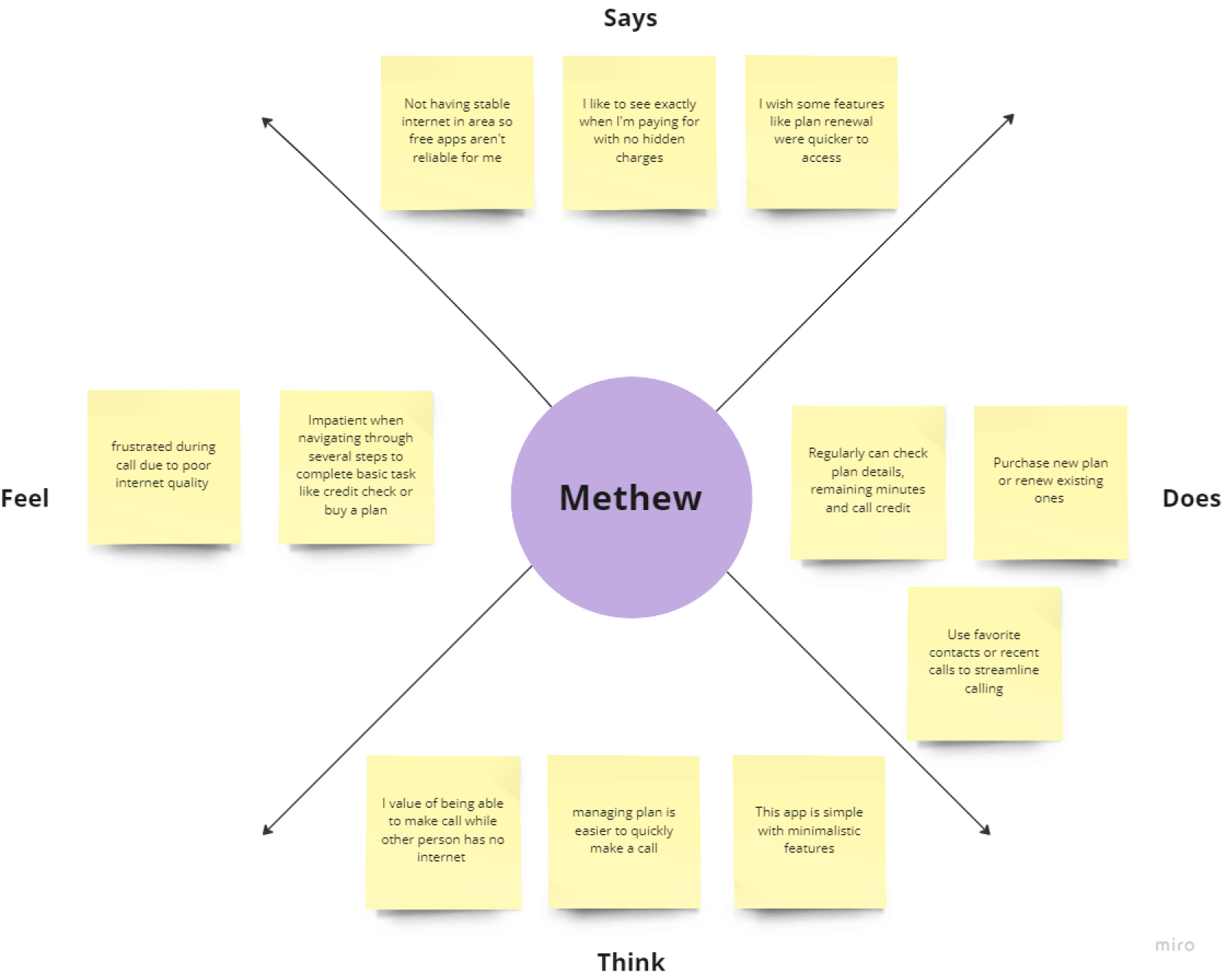
Empathy Map
This process was done to define the target audience with more clarity, as well as illustrate their needs and actions. Empathy map help me gain perspective on their thoughts and feelings. The data in empathy map is based on insights from user interviews.
Pain
Both parties need a stable internet connection to communicate.
Hidden costs such as data usage, making “free” calls expensive.
Limited ability to call non-tech-savvy individuals or those without smartphones.
Frustration with app crashes or poor performance during weak internet connections.
Gain
Reliable international calls even without internet for the recipient.
The recipient doesn’t need internet access to receive a call.
Transparent pricing with no hidden fees or unexpected charges.
Can call any phone number globally using just your mobile number.
User Persona
With the data collected from the interviews and survey, I created a persona representing an ideal user of the application. The persona helped me arrive at better solutions as it gave an in-depth understanding of the user goals and frustrations and the overall personality.
Sarah Thompson
32 Years old
Unmarried
New York, USA
Nurse
2 children
Bio
Sarah is a nurse working long hours in a busy hospital. With family spread across Europe and Asia, she regularly makes international calls to stay connected with her loved ones. Sarah has been using free calling apps like WhatsApp, but she often faces issues with poor call quality, especially when her family doesn’t have a reliable internet connection. After growing frustrated with these limitations, she started using Slickcall, seeking a more dependable way to keep in touch.
Key Characteristics
Provide a user-friendly experience with minimal navigation, so Sarah can easily access favorite contacts, manage her plan, and see her credit balance.
Offer clear, transparent pricing without hidden fees or unexpected costs, making it easy for users like Sarah to know exactly what they’re paying for.
Fast actions and multi-purpose screens that allow Sarah to complete key tasks, such as renewing her plan or making calls, with just a few taps.
Frustrations & Pain points
Poor call quality or dropped calls when her family’s internet connection is unstable.
Both she and her family need a good internet connection to communicate, which isn’t always possible.
Hard to track plan usage, credits, and renewal status in calling apps.
Card Sorting
Through this technique I discovered how people understand and categorize the problem.
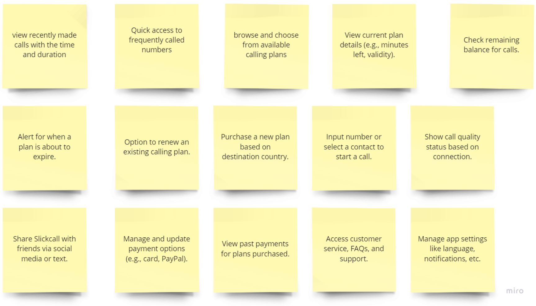
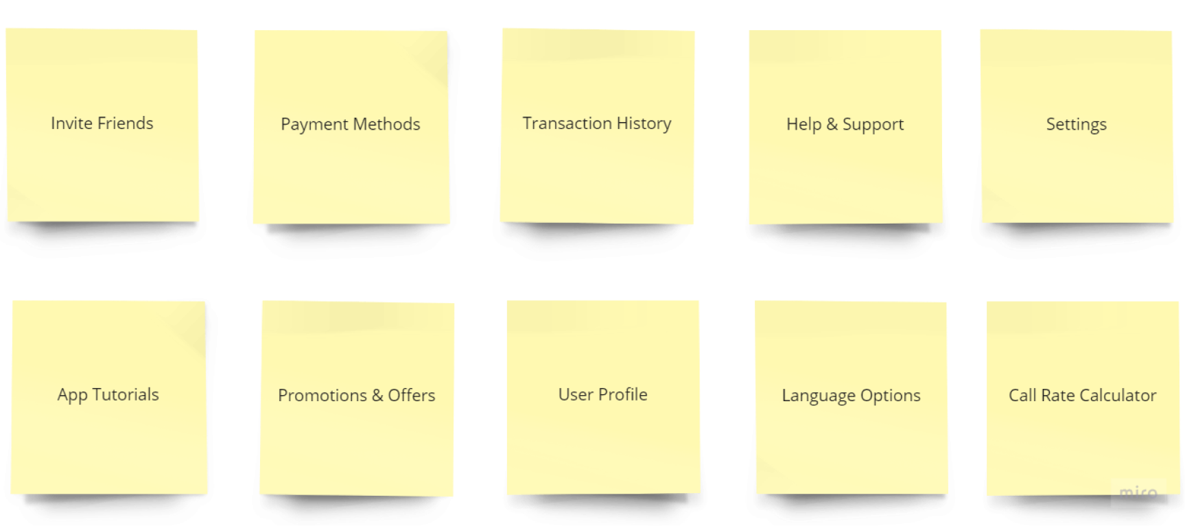
Unsorted Cards
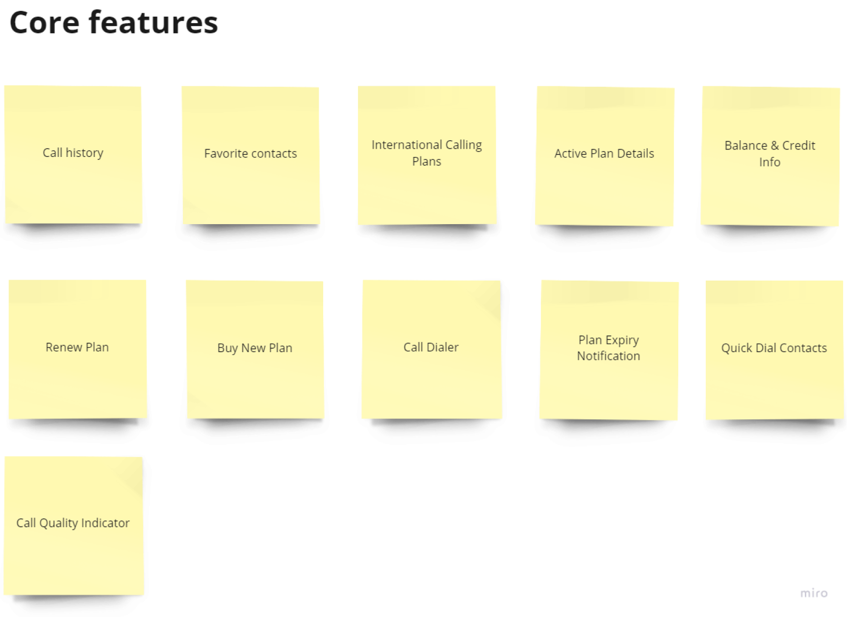
Supporting features
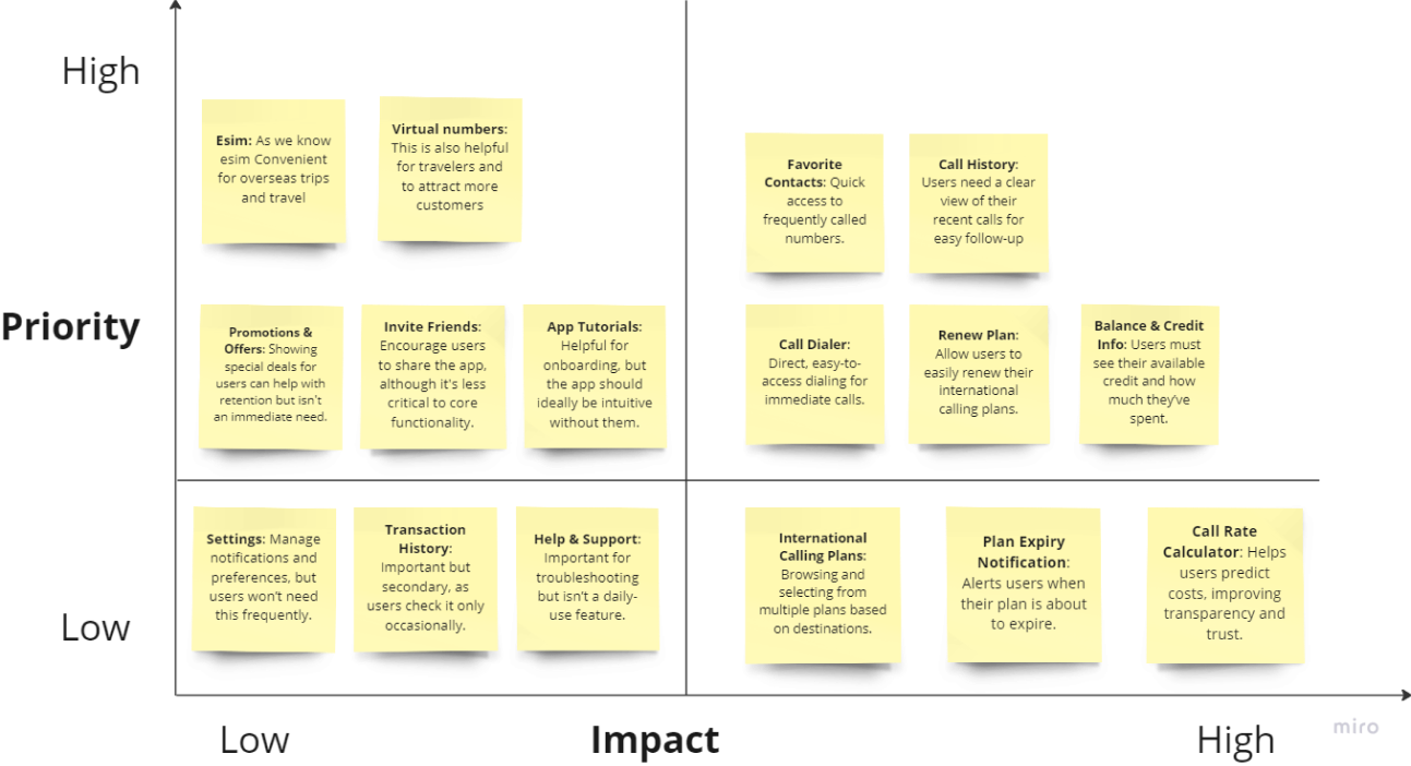
Feature prioritization matrix
This prioritization method uses two primary criteria to rank features that are considered for implementation: the impact that the feature will have on the end user and the effort required to implement that feature.
Through this method I decided with which features we should go for now.
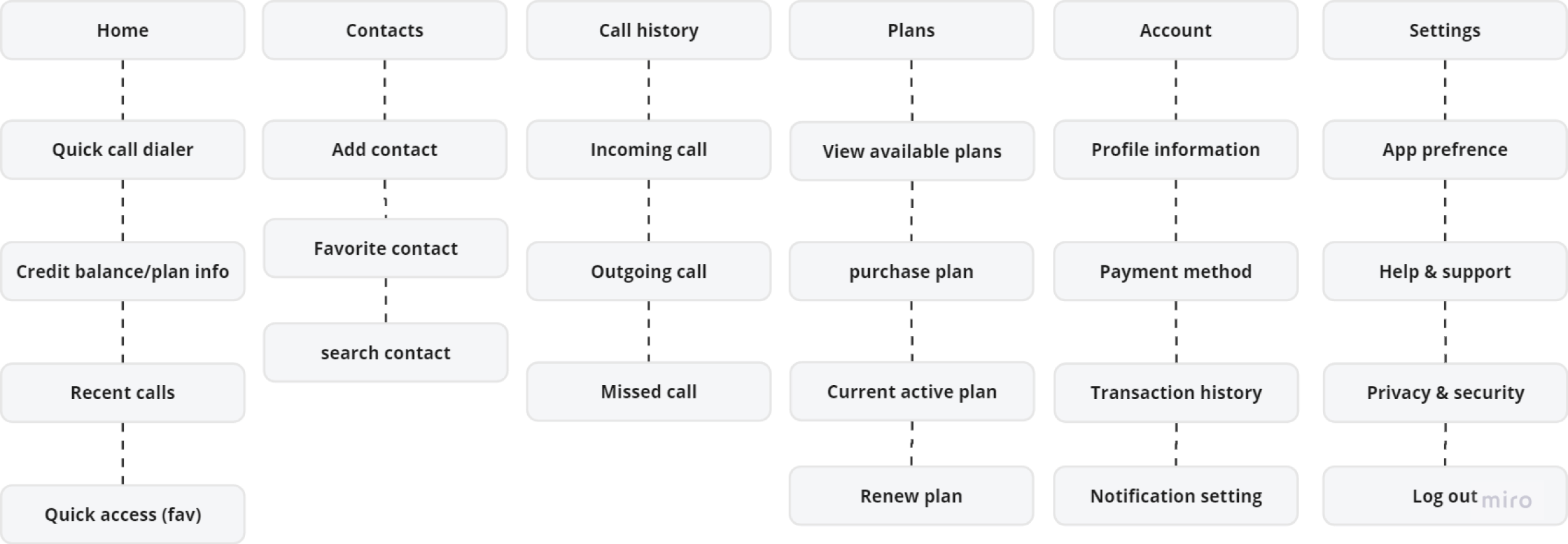
Information architecture
A well designed, user friendly information architecture that user spend less time and effort searching for information and successful in finding what they need.
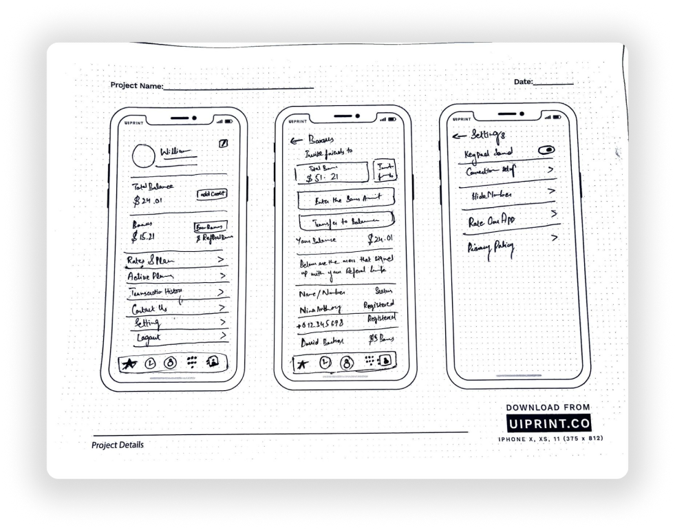
Wireframes
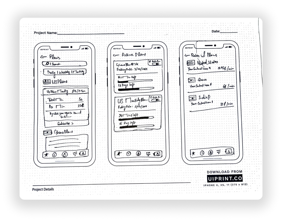
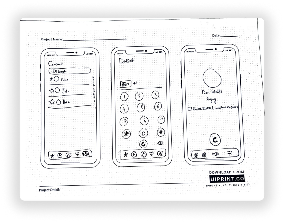
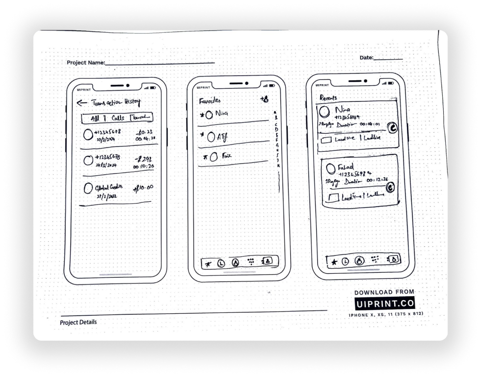
First I sketched low fidelity wireframes on paper. After making correction in them. I moved on to designing these high fidelity wireframes or Final UI screens in Figma.
Paper sketches
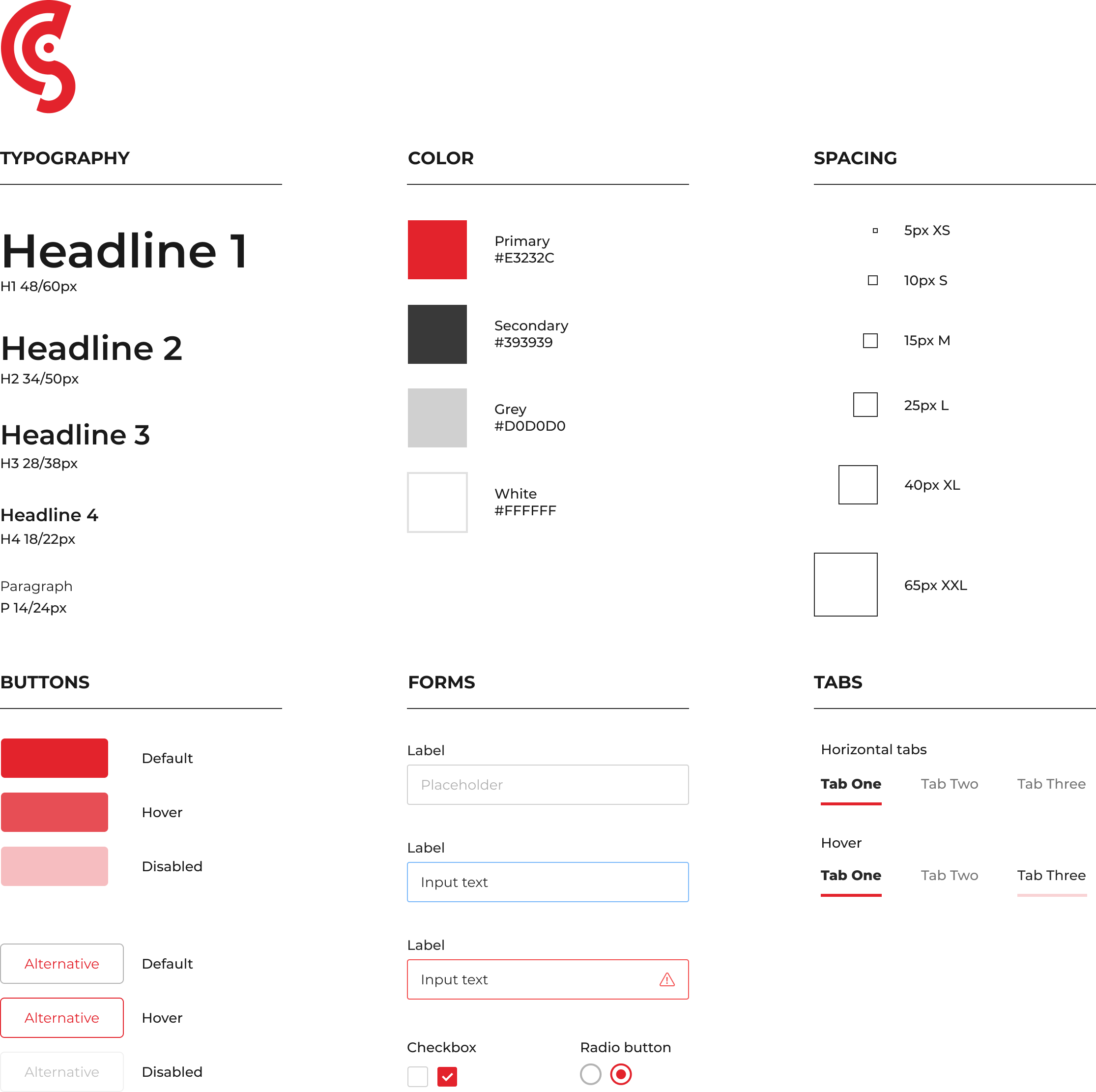
Design System
Final UI Design
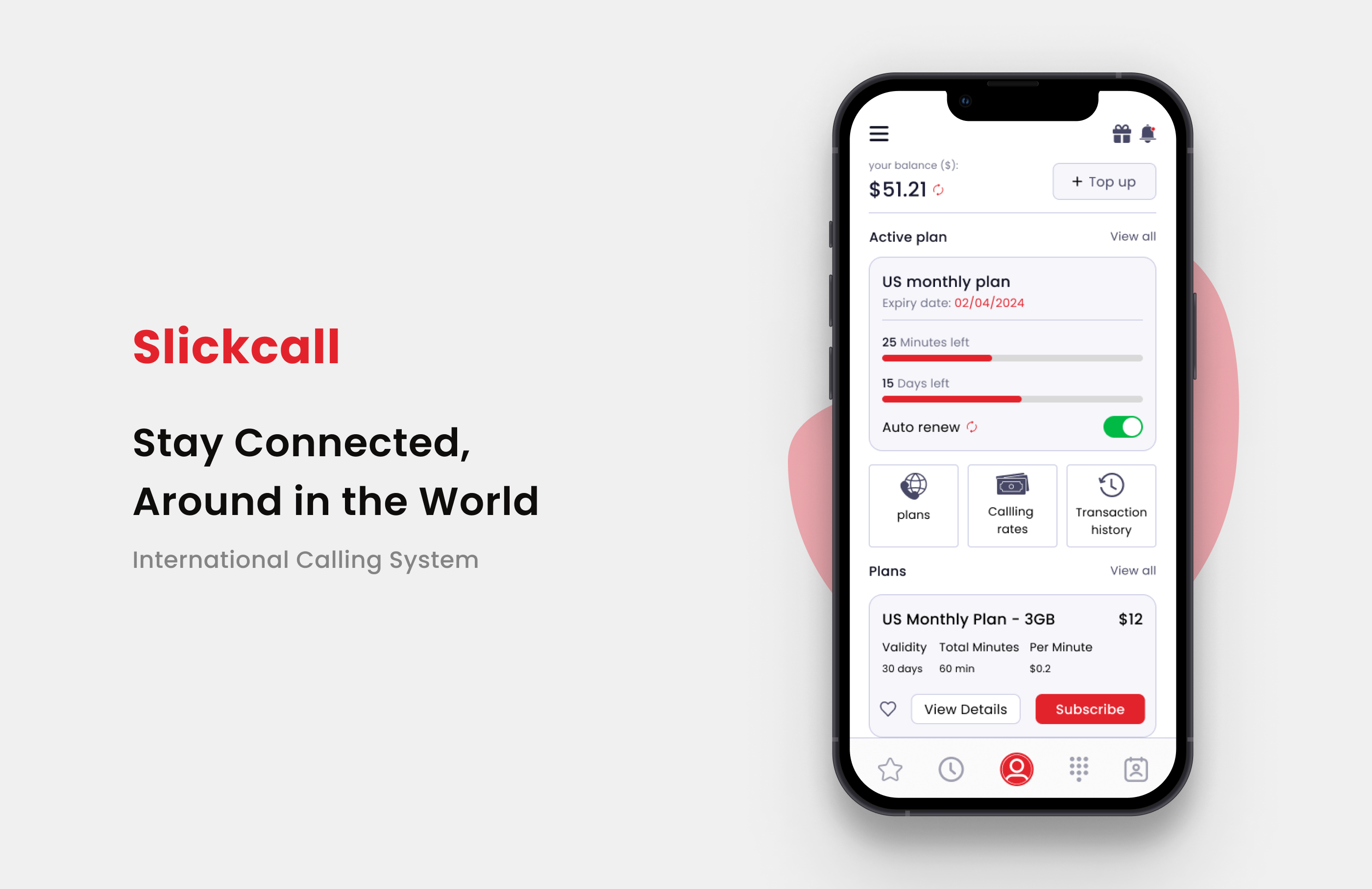
Usability Testing Scenario: Managing Account Balance and Plans in Slickcall
After the visual design was complete I tested the prototype with some new and returning users I wanted to see how user-friendly the application is. The test was conducted over google meet video calls where the participants were given the following tasks while I observed how they navigated through the application
Objective: Observe how users navigate the updated Slickcall app to manage their account balance, active plans, and find specific features. Identify areas of confusion, hesitation, or frustration, as well as behaviors indicating satisfaction or efficiency.
Given Scenario: “Imagine you are a regular user of Slickcall, and you need to check your current balance, review your active plan, and ensure that auto-renewal is turned on. Additionally, you want to look for any available new plans and, if you find one you like, subscribe to it. Finally, you want to check your transaction history to confirm a recent top-up.”
Tasks performed:
Check Balance: Locate your current balance and ensure it is up to date.
Review Active Plan: Navigate to the active plan section, view the remaining minutes and days, and check if auto-renew is enabled.
Explore New Plans: Go to the plans section, explore different options, and select one to view its details. If it fits your needs, proceed to subscribe. View Transaction History: Find and review the transaction history section to verify a recent top-up.
Follow-Up Questions:
Navigation: Did you find it easy to locate the balance and plan information? Why or why not?
Understanding: Was the information about your plan usage (minutes and days left) easy to understand?
Plan Subscription: How easy or difficult was it to explore and subscribe to a new plan?
Suggestions: Is there anything you would change to make this app easier to use?
Suggestion to make the experience better
Use Iconography to Enhance Readability
Prioritize and Simplify Navigation Options
Provide a brief summary of the user’s active plan directly on the profile page (e.g., minutes left, expiry date).
Add Notification or Alert Indicators
Implementing feedback
Based upon the testing and the feedback, I planned something new for this screen.
Success metrics
My learning
Working on the Slickcall project taught me the importance of user-centered design in solving real-world connectivity challenges. I learned how to simplify complex navigation and enhance usability, making it easy for users to access essential features like balance, plans, and transaction history.
This experience also deepened my understanding of prioritizing features that address users’ primary needs for reliable and affordable international communication.